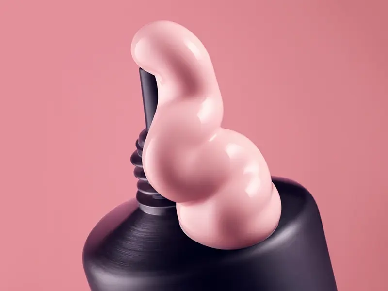
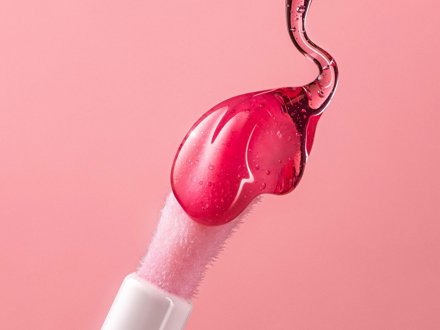
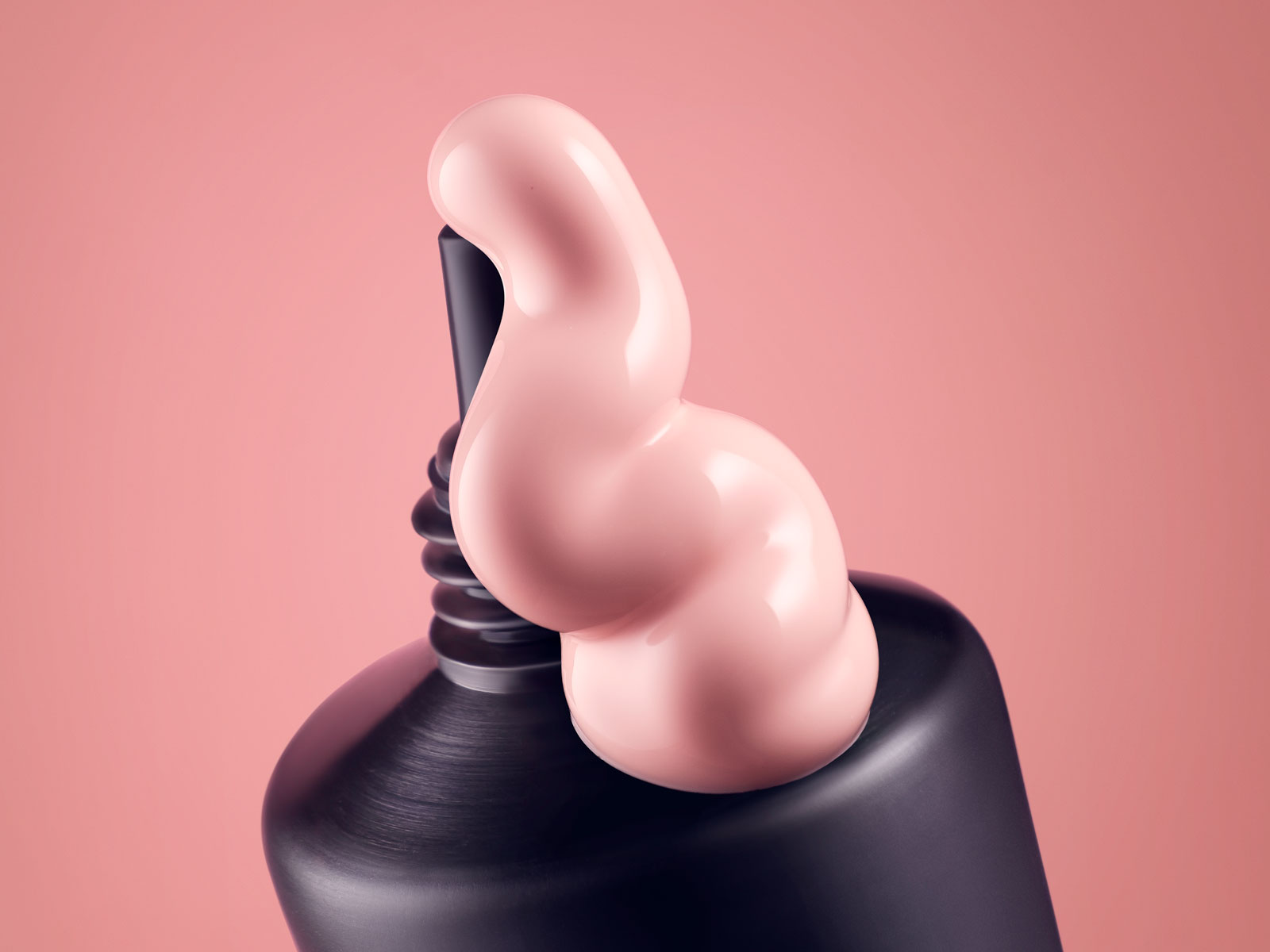
Texture at Its Best.
This series of cosmetic product visuals for Veze starts where most beauty campaigns stop: at the material itself. Pink, thick, perfectly shaped — the cream caught at the exact moment it leaves the tube. No distraction. No set dressing. Instead, just the product, making its case entirely on its own terms.
When Cosmetic Product Visuals Speak for Themselves
Great cosmetic product visuals don’t need context clues. The texture, the colour, the physical presence of the formula — these are the message. We therefore framed the Veze cream around a single principle: isolate the material, remove everything else, and let the light do the work. However, every angle was chosen deliberately — to show how the cream moves, holds its shape, and would feel on skin. The result communicates the formula’s quality before a single word is read. The format is intentionally minimal — because when the material is this good, a busy background would only get in the way.
For a similar approach in a different beauty category, see our Daisy Dream CG and photo visual.
Why Strong Cosmetic Product Visuals Drive Sales
In beauty, purchase decisions happen in a fraction of a second. The viewer doesn’t read first — they feel first. A compelling image — one that makes the formula look as good as it feels — does more selling than any headline. As a result, production quality isn’t a budget line to cut; it’s the argument itself. Our article on why great products deserve better than a photo shoot explores, for example, why visual quality directly affects conversion.
More Cosmetic Product Visuals
Additionally, for further cosmetic work across materials and formats, explore our perfume nature CG photography or see the full range of our 3D product visualization service.
Let’s make it hapen together – your idea, our visual. Get in touch today.