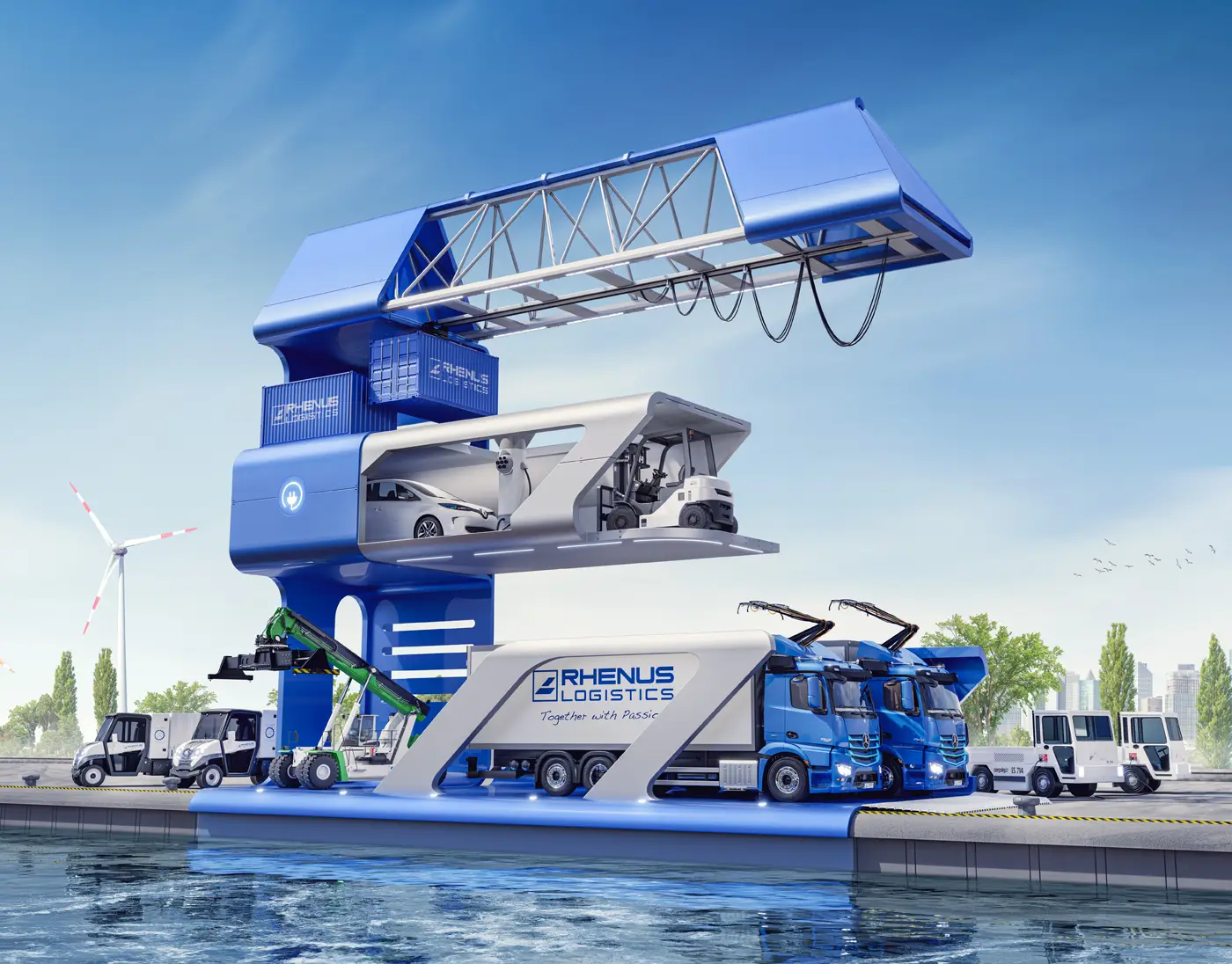
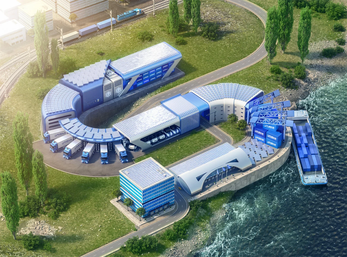
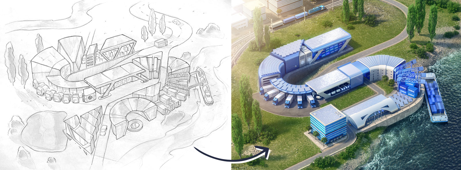
This logistics sustainability CGI campaign turned a transport company’s brand values into a series of architectural 3D key visuals. The brief was therefore clear: visualise sustainability as something built and structural — not abstract. We therefore took letters from the client’s logo and assigned each one a theme. “The S stands for solar energy.” That S became a physical structure covered in solar panels, rendered in photorealistic 3D.
Logistics sustainability CGI — concept to render
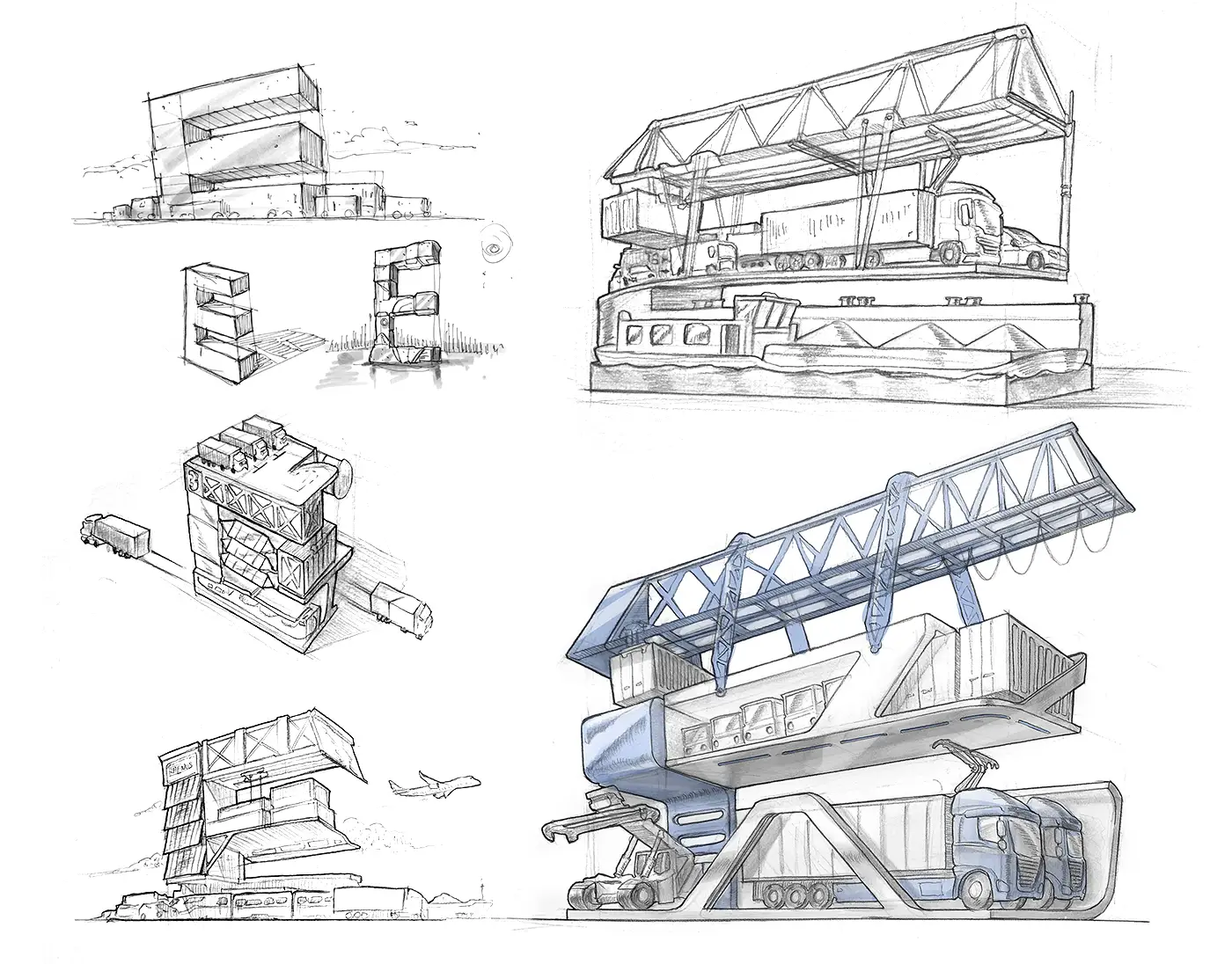
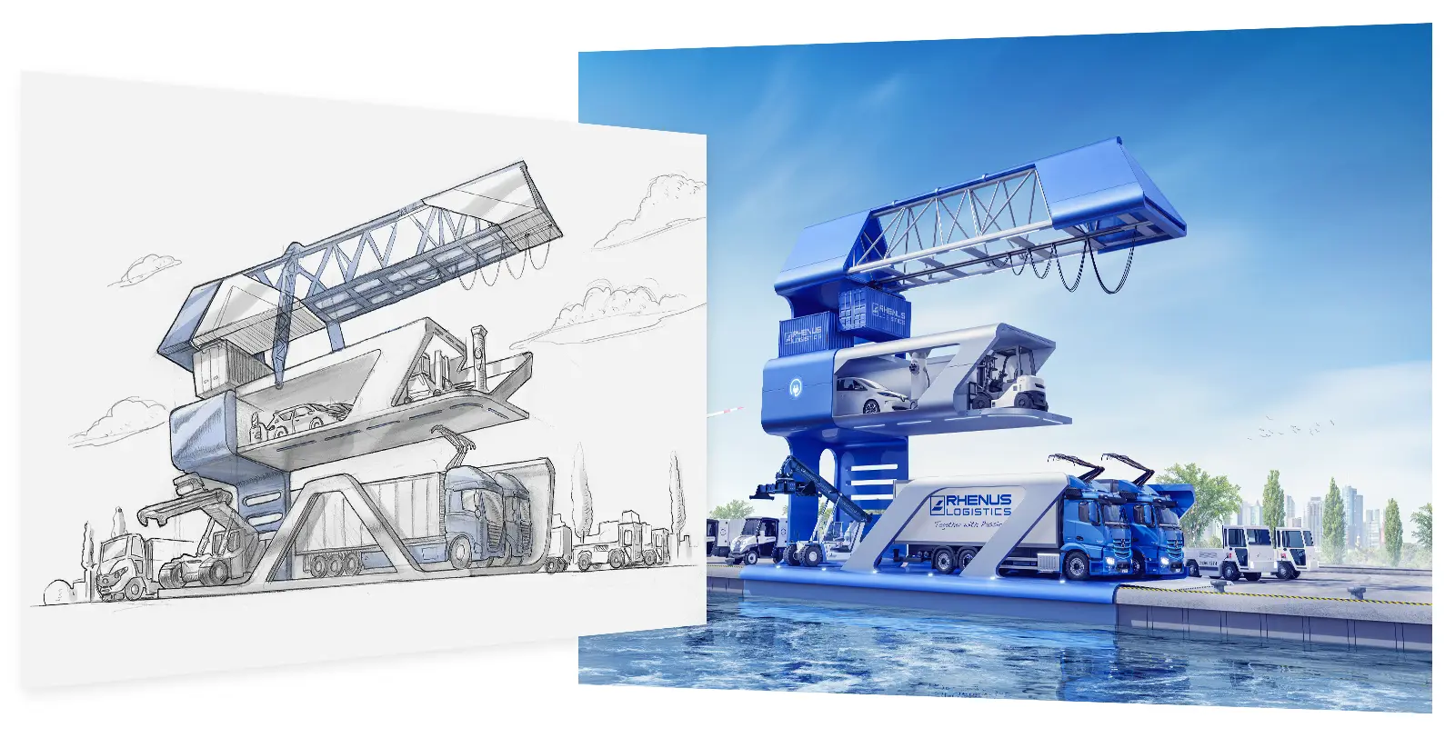
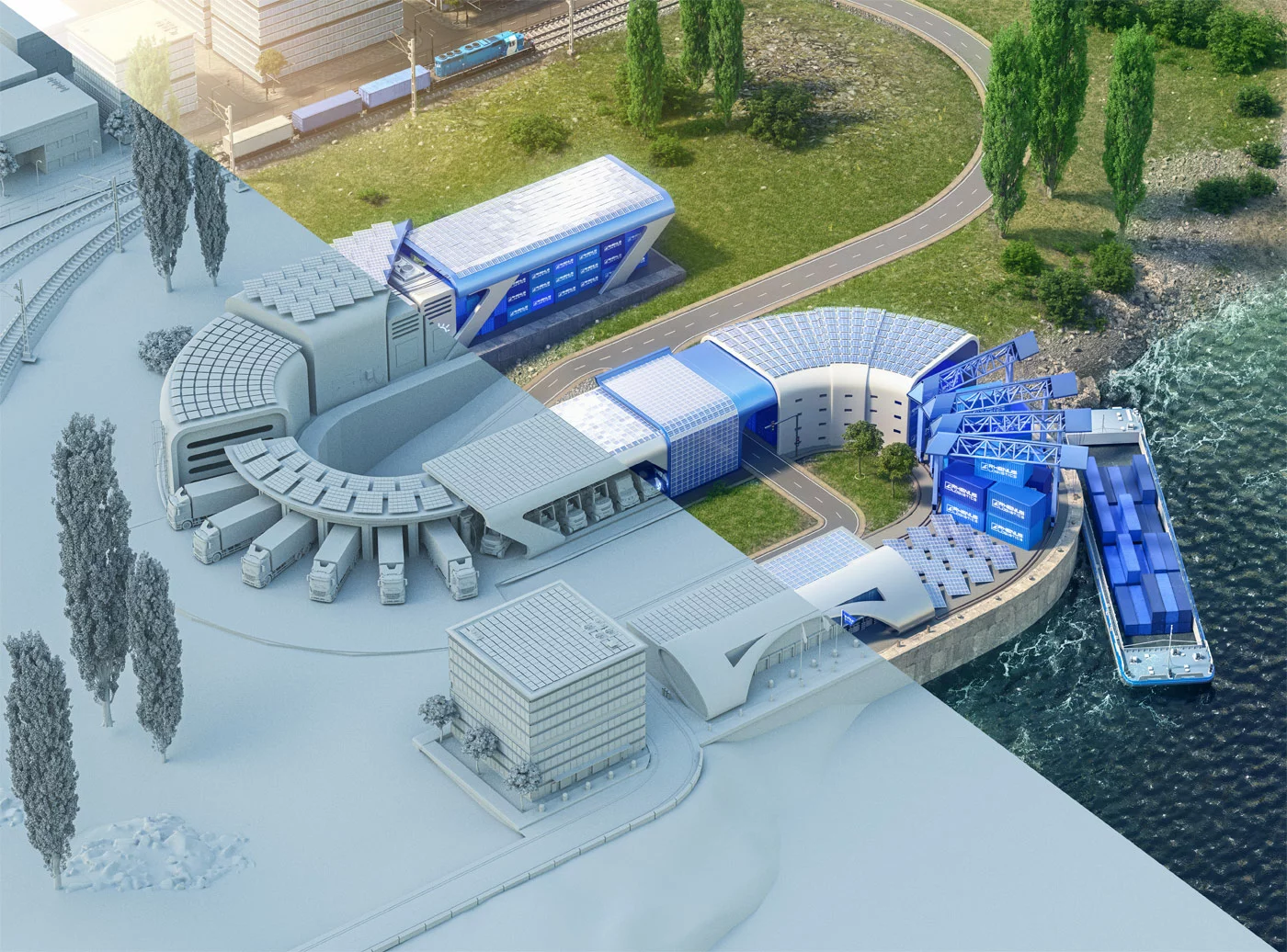
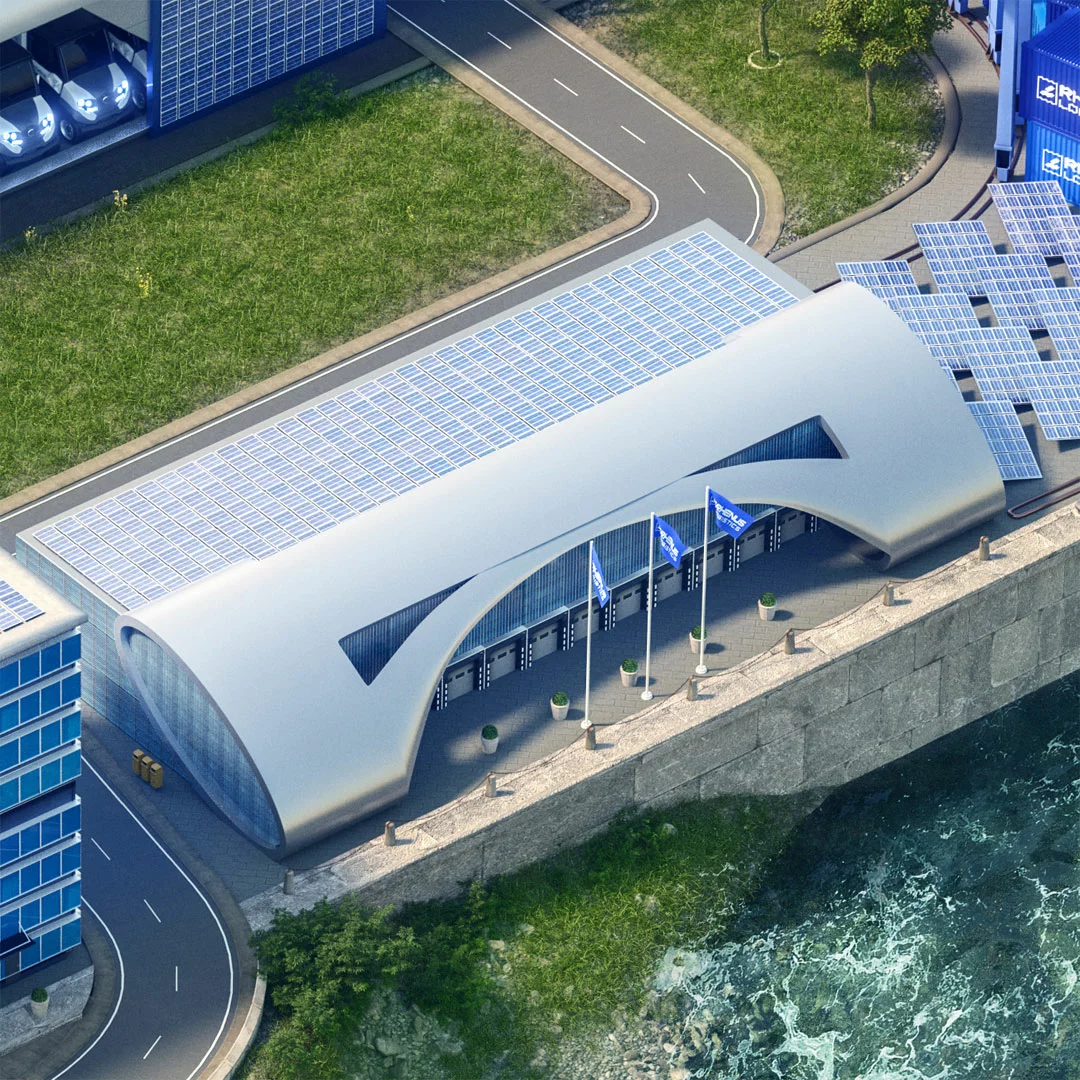
Each letter became its own architectural environment, built in 3D from concept scribbles through to final key visual. The making-of frames show the full progression: rough layout, geometry, lighting, and composite. As a result, the campaign communicates a company’s high-tech development and long-term commitment without relying on stock imagery. Indeed, we are proud to count this client among our long-term partners. The work was produced in collaboration with the agency responsible for the overall campaign strategy.
When abstract values need a physical form
Sustainability messaging in transport logistics often struggles visually — the subject matter is inherently infrastructural. CGI, however, removes that constraint entirely. We can build any environment, any scale, any lighting condition. Furthermore, the assets are fully reusable: the same 3D scene can be adapted for print, web, outdoor, and internal communications without a new production. Sustainable logistics initiatives increasingly rely on visual storytelling to communicate progress — and CGI is the most flexible tool for that job. Our key visuals service and 3D visualisation work together for exactly this kind of brand campaign.
Related work
See our logistics CGI key visuals for a six-division brand campaign, or our energy transition key visual for another sustainability-driven project. Your brand values deserve visuals that carry weight. If you want to see the broader argument for CGI, our piece on why great products deserve better than a photo shoot covers it directly. Let’s build them. Get in touch. We build campaigns that communicate exactly what your brand really stands for — clearly, visually, and at any scale.